Apple's Design Revolution
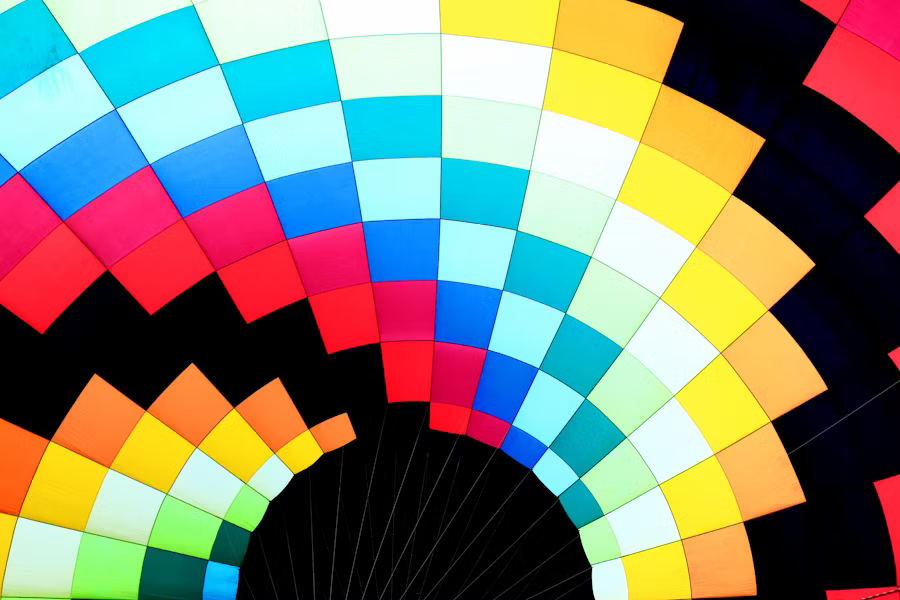
At WWDC 2025, Apple unveiled the most significant interface design update since iOS 7 — Liquid Glass, a revolutionary design language. This groundbreaking approach spans all Apple platforms, achieving true design system unity.
Apple's VP of Human Interface Design, Alan Dye, stated: "This is our most extensive software design update. By reimagining the fundamental elements of software, the new design employs a revolutionary material called Liquid Glass, combining the optical properties of real glass with Apple's signature fluidity."
Core Technologies
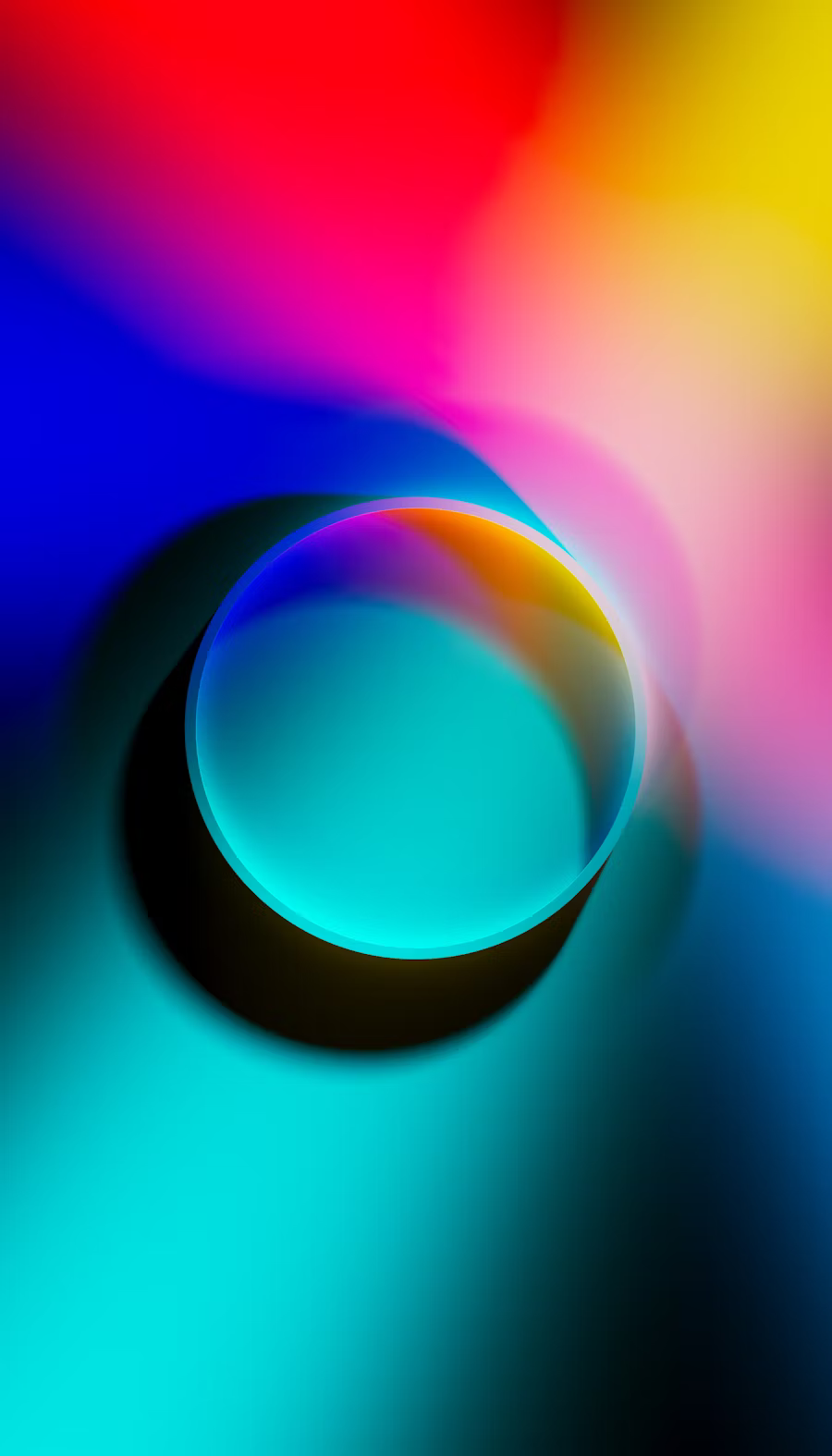
Lensing Technology
Dynamically bends and shapes light for authentic optical refraction
Real-time Adaptation
Intelligently adjusts transparency and color based on background content
Fluid Animation
Simulates natural liquid flow and deformation characteristics
Environmental Awareness
Responds to device motion and lighting changes
CSS Implementation
Creating authentic liquid glass effects requires combining multiple CSS techniques. The key is layering different visual elements to simulate the complex optical properties of real glass materials.
Implementation Strategy
- Layer-based approach: Use pseudo-elements for depth
- Backdrop filters: Blur background content realistically
- SVG distortion: Add organic noise patterns
- Strategic opacity: Balance visibility and transparency
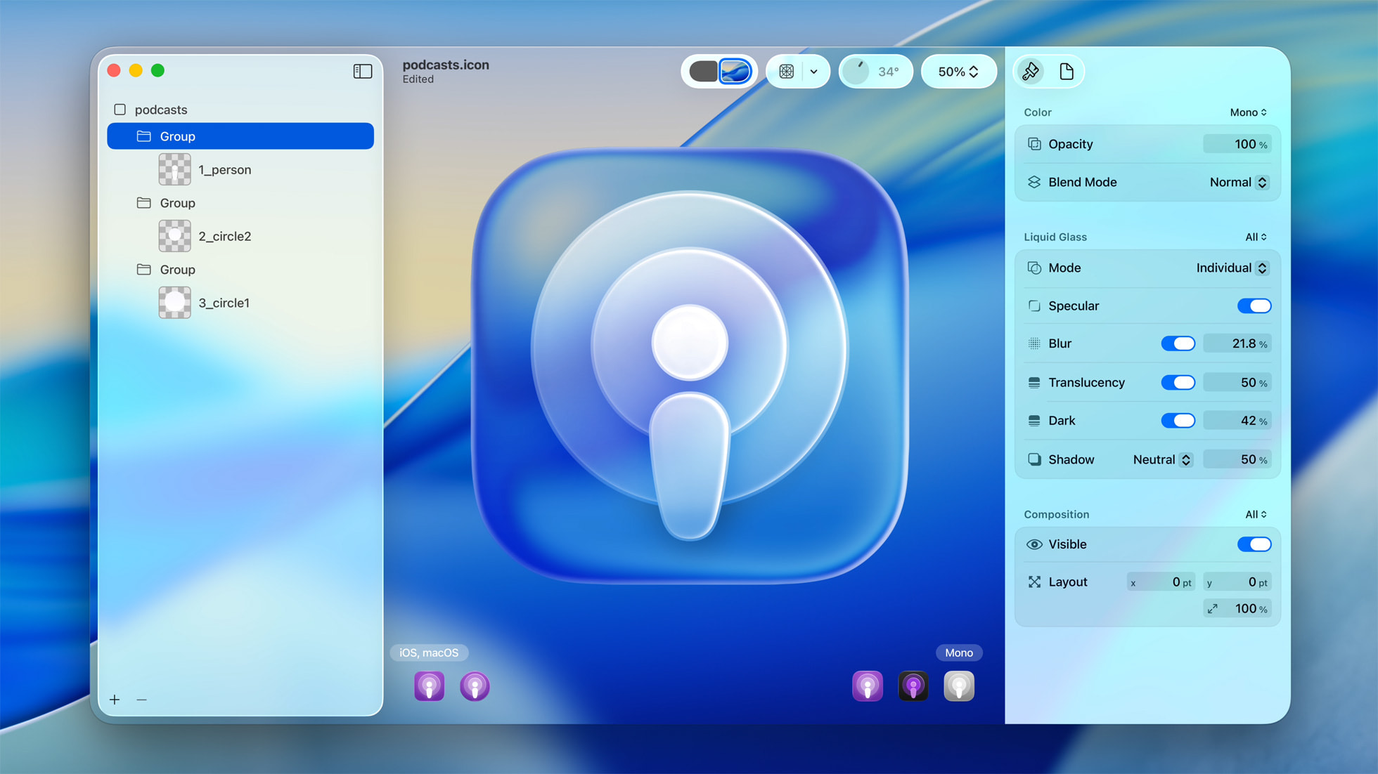
Step 1: Base Glass Structure
The foundation uses a three-layer system: main element for borders and basic styling, ::before for inner shadows and tinting, and ::after for backdrop effects and distortion.
.glass-card {
  position: relative;
  border-radius: 20px;
  isolation: isolate;
  transition: all 0.3s cubic-bezier(0.4, 0, 0.2, 1);
  box-shadow: 0px 6px 24px rgba(0, 0, 0, 0.2);
  backdrop-filter: blur(1px);
  -webkit-backdrop-filter: blur(1px);
  border: 1px solid rgba(255, 255, 255, 0.3);
}
Step 2: Inner Shadow Layer
The ::before pseudo-element creates internal depth using inset box-shadows and a subtle background tint that mimics light refraction through glass.
.glass-card::before {
  content: '';
  position: absolute;
  inset: 0;
  z-index: 0;
  border-radius: 20px;
  box-shadow: inset 0 0 20px -5px rgba(255, 255, 255, 0.6);
  background: rgba(255, 255, 255, 0.05);
}
Step 3: Backdrop Blur Effects
The ::after layer applies backdrop-filter for realistic background blur. This is the core effect that creates the frosted glass appearance by blurring content behind the element.
.glass-card::after {
  content: '';
  position: absolute;
  inset: 0;
  z-index: -1;
  border-radius: 28px;
  backdrop-filter: blur(8px);
  filter: url(#glass-distortion);
  isolation: isolate;
}
Step 4: Optional SVG Enhancement
While the SVG filter is included for potential future enhancements, the primary glass effect is achieved through backdrop-filter and carefully crafted shadows and transparency layers.
<svg
  xmlns="http://www.w3.org/2000/svg"
  width="0"
  height="0"
  style="position:absolute; overflow:hidden"
  className="hidden"
>
  <defs>
    <filter
      id="glass-distortion"
      x="0%"
      y="0%"
      width="100%"
      height="100%"
      className="hidden"
    >
      <feTurbulence
        type="fractalNoise"
        baseFrequency="0.008 0.008"
        numOctaves="2"
        seed="92"
        result="noise"
        className="hidden"
      />
      <feGaussianBlur
        in="noise"
        stdDeviation="2"
        result="blurred"
        className="hidden"
      />
      <feDisplacementMap
        in="SourceGraphic"
        in2="blurred"
        scale="77"
        xChannelSelector="R"
        yChannelSelector="G"
        className="hidden"
      />
    </filter>
  </defs>
</svg>
Customization Guide
Glass Properties
- Blur intensity: Adjust backdrop-filter blur(1px-30px)
- Border opacity: Control rgba alpha values (0-0.5)
- Corner radius: Match your design system (8px-32px)
- Shadow depth: Modify box-shadow blur and spread
Live Demo
The interactive demo on the right showcases a complete Liquid Glass implementation with:
- • Real-time clock display with glass typography effects
- • Interactive music player with translucent controls and progress
- • Notification cards demonstrating proper layering techniques
- • Backdrop-filter blur creating authentic frosted glass appearance
- • Responsive design adapting to different screen sizes
All effects are created using pure CSS properties, primarily backdrop-filter, box-shadow, and strategic transparency. This ensures optimal performance across modern browsers while maintaining authentic glass aesthetics.